I was faced with a challenge
Redesign an enterprise product for the market leader of the steel doors industry
The product had grown quickly — components were inconsistent, states were missing, and no shared design system existed. The job was to audit everything, configure MudBlazor to the brand, and redesign the key flows that were causing friction.
My Role
UX Designer
Team
1 UX Designer
Timeline
6 months and ongoing
Overview
The client is a premier American manufacturer of residential, commercial, and industrial garage doors. The challenge was to redesign their legacy configurator and sales portal across 8 different user types, that can be easily scaled for future requirements.
PROCESS
Cycle followed for each module
01
Study Current Design
UI audit of all existing flows and components
02
Understand User Goals
What users need to accomplish and in what context
03
Identify Usability Issues
Gaps, missing states, inconsistencies, friction points
04
Design &
Iterate
Version-by-version until the solution holds
THE WORK
What we actually do
manage
CLICKS
Designed intuitive interactions that guide users effortlessly. Every click is intentional, reducing friction and improving the overall user experience.
make it
CLEAN
The designs promotes minimal, well-structured components that keep interfaces simple and easy to navigate.
ensure
CONSISTENCY
Maintained a unified look and feel across every product and platform. Shared tokens, components, and guidelines keep teams building in harmony.
create
CLARITY
Communicate with purpose. Clear hierarchy, legible typography, and thoughtful layouts ensure users always know where they are and what to do next.
build
COMPREHENSIVELY
A complete system built to scale. From foundational styles to complex components, everything you need to ship confidently — nothing left to chance.
DESIGN DECISIONS
How we got to the right answers
Every major design choice went through multiple iterations. Here's what we tried, what broke, and what finally held.
Top Navigation
Old design
Not accounting for different screen ratios — items collapsed or overlapped on narrower displays.

Final Design
Final layout saves space, accounts for different screen ratios, and establishes a clear hierarchy between navigation, customer context, and content — all without breaking when flyouts or errors appear.

Information Bar
Old design
A creative customer bar is exciting to have, but what if there’s a flyout or error?

Old design
The information under the customer bar and error notification gets hidden
Final Design
The design decisions account for this

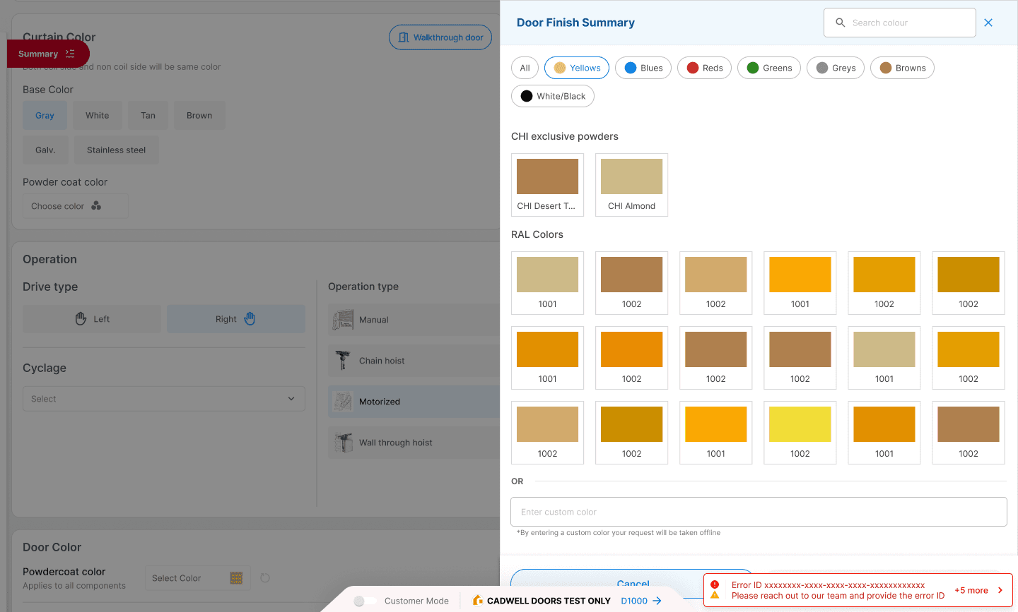
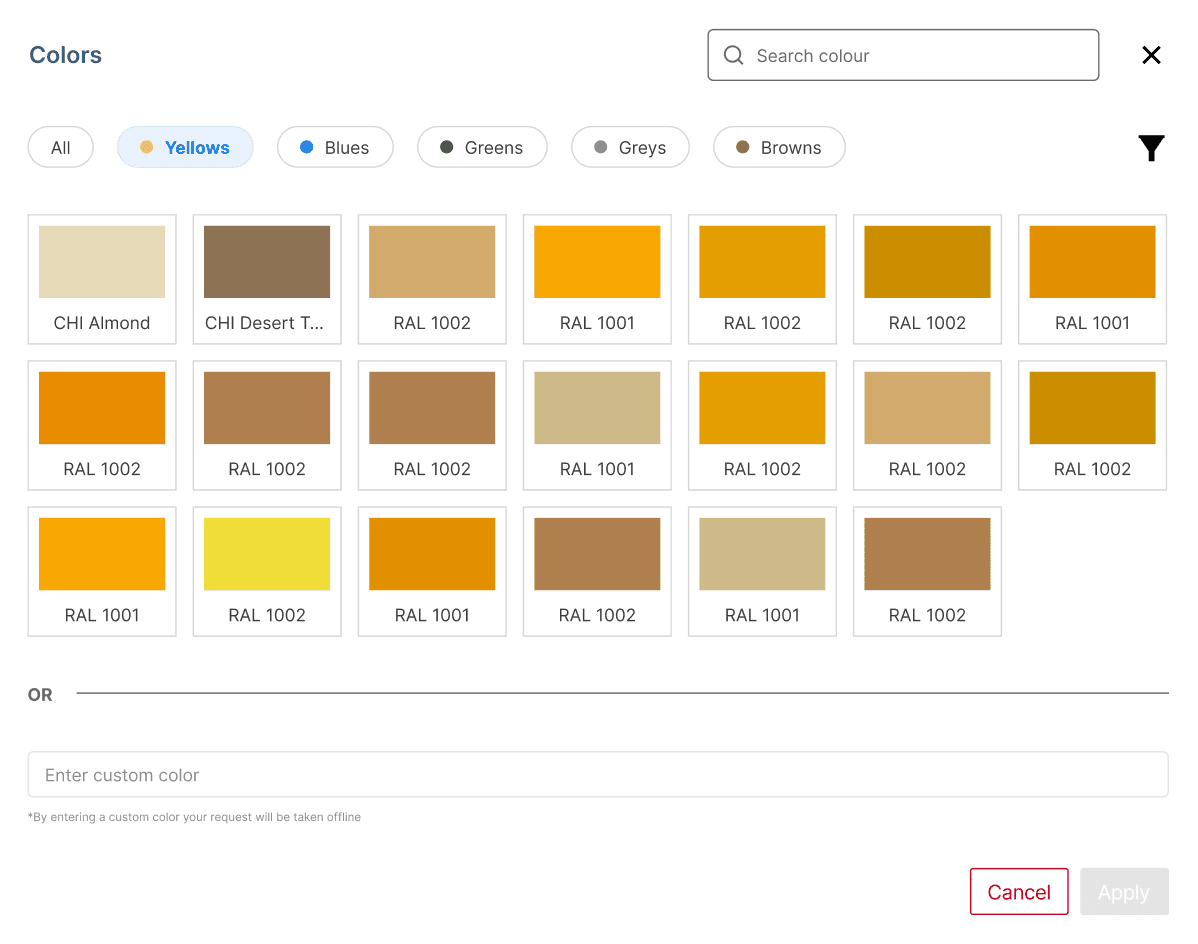
Colours Section
V1
Same as v0, custom colors get their own tab, quick filters pop as chips.
Too many clicks, slows users down and adds friction
V2
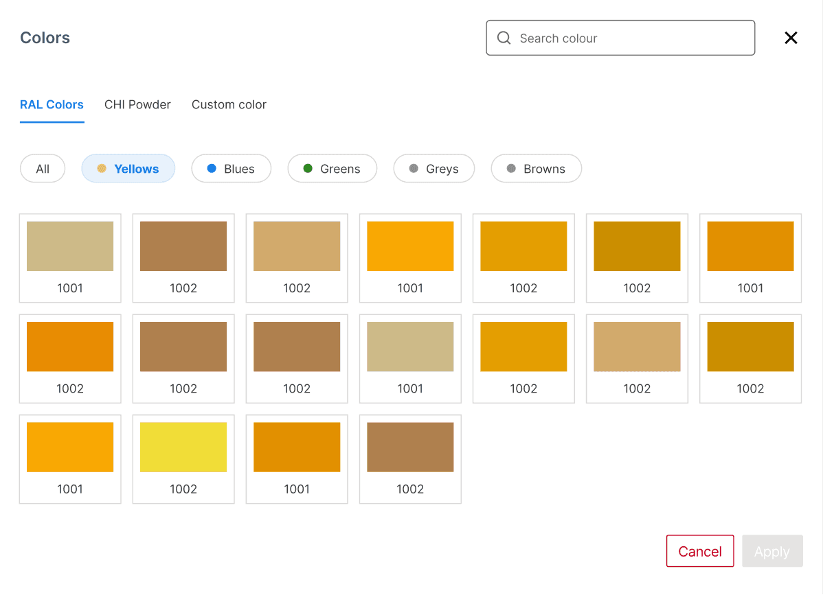
V3
All in one view- chips to filter color, filter for type.
Too many clicks for just two filter options
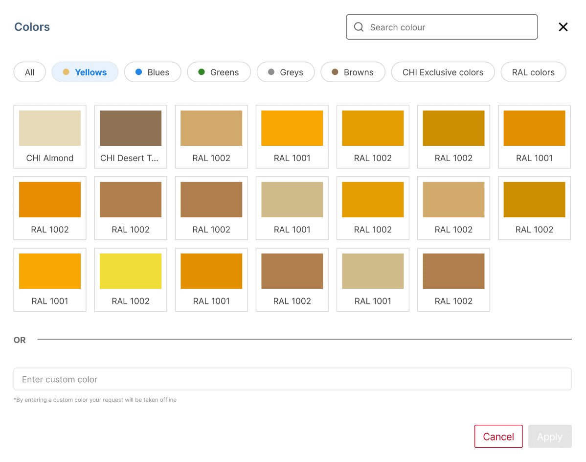
Final Design
Chips for quick color filtering, CHI first, RAL next, as sections on the same screen.
BUT might not account for many “types” of colors

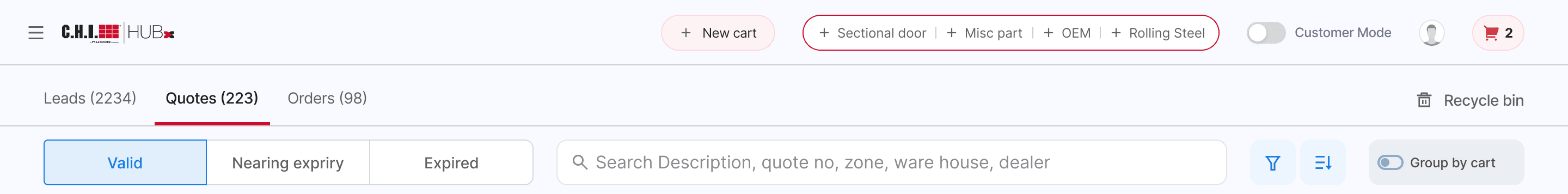
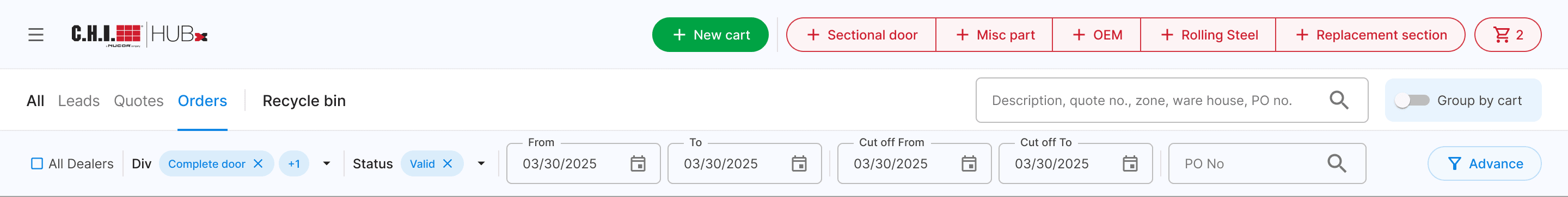
Advanced Filters
V1
Upfront options; key states as quick filters; advanced filter & sort.
“Valid” and “Expired” should be deprioritized; too many advanced filters.
V2
Global search; updated hierarchy; div filter; advanced filters on 3rd/hover 4th.
Two searches unnecessary; PO Number not a dropdown; upfront filters feel cluttered.

V3
Single search; PO Number as search; other filters in advanced flyout.
Search & PO search are redundant; cutoff applies only to orders; div & date-range filters are inconsistent.
V4
Single search; PO Number as search; other filters in advanced flyout.
Search & PO search are redundant; cutoff applies only to orders; div & date-range filters are inconsistent.
Final Design
Search and PO search are redundant; cutoff only for orders; inconsistent div/date filters.
Ensured flyout and top filter dropdown consistency; no “Select All” - “Clear” resets to none selected (default = all).


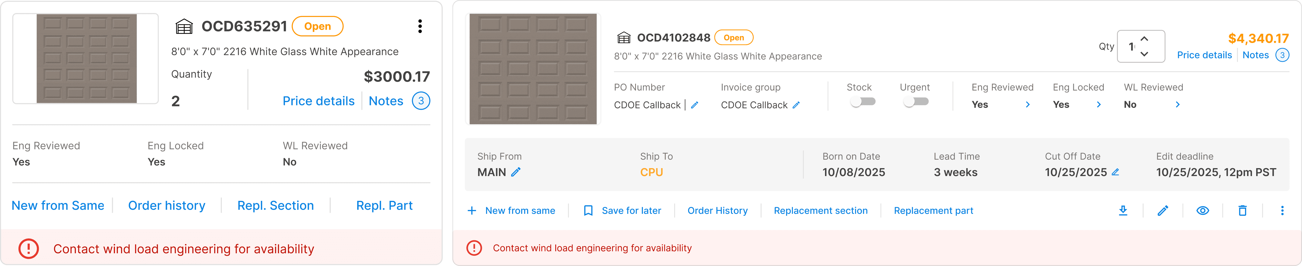
Cart Details
Old Design

Final Design
Analyzed quote/order carts, grouped actions, optimized infomation display, and aligned summary with detail views